The Evolution of AFL Guernseys: A Look at Design and Creativity
The guernsey is more than just a piece of clothing in Australian football; it’s a symbol of identity, heritage, and often, a reflection of the club’s values. While some teams have remained true to their traditional designs, others have taken bold steps to modernize their look. This article explores how different clubs have approached their guernsey designs, focusing on creativity, color schemes, and overall aesthetics.
GWS Giants
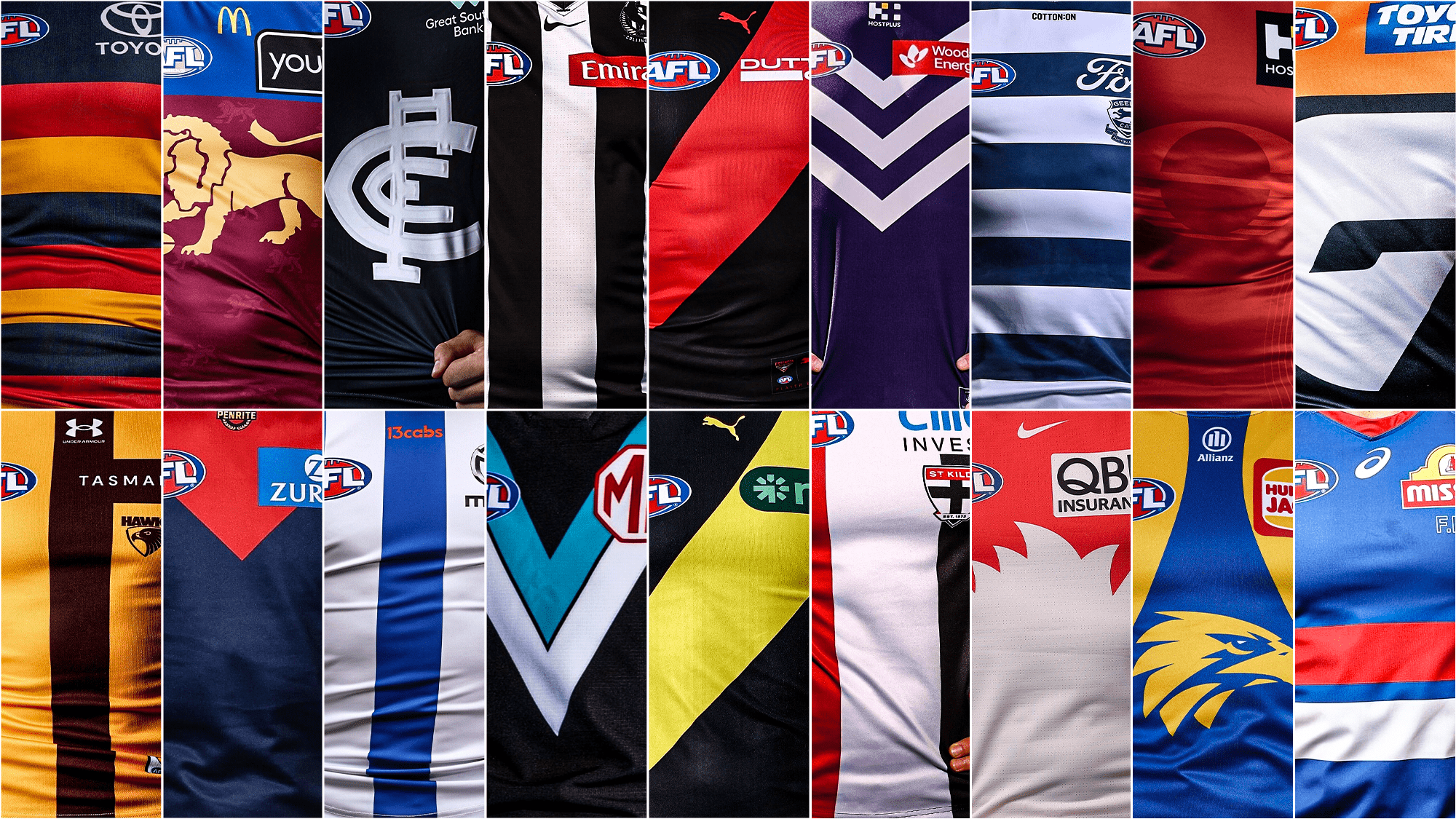
The GWS Giants’ orange guernsey is a tough one to get right. Orange is a challenging color to make visually appealing, but the Giants have tried their best by incorporating all their colors into the design. The pattern has been spruced up a bit, but the overall look remains unappealing for long periods. The big “G” appears very superhero-like and forcibly squished, which doesn’t help the design.
Gold Coast Suns
The Gold Coast Suns’ guernsey is one of the least impressive in terms of design. It’s all red with no yellow, and there’s little to no pattern or visible team logo. This lazy approach to a rebrand is one of the worst I’ve seen. The lack of visual interest makes it hard to take seriously as a modern design.
Adelaide Crows
The Adelaide Crows’ guernsey is extremely basic and represents a significant downgrade from their previous design. The absence of the Crow on the guernsey removes one of the most iconic elements that made it stand out. While the navy blue and red work well together, the yellow on the sleeves and between the stripes is an ugly turnoff.
St Kilda Saints
The St Kilda Saints’ guernsey is the worst Victorian guernsey on the list. It features a simple three-stripe cover with no pattern or cross, limiting its potential. The sponsor logo doesn’t help either, as it’s an out-of-place glaring blue that distracts from the overall design.
Hawthorn Hawks
Hawthorn’s guernsey tries to be gold and brown but ends up looking more like a mustard color. The brown helps save the design, and the stripes are solid, but the excessive use of yellow makes it hard to appreciate.
Carlton Blues
Carlton’s guernsey is one of the most controversial. While it’s iconic and old, it’s essentially a logo slapped onto a navy-blue base. However, the logo is a different color, and the navy blue is iconic, even inspiring the Victorian Origin team.
West Coast Eagles
The West Coast Eagles’ guernsey uses yellow in a better tone compared to other teams. The pattern matches the club’s mascot, with the yellow separating to the side like an eagle opening its wings. A darker blue could have made this one of the best designs.
Geelong Cats
Geelong’s guernsey is one of the cleaner looks for a stripped design. All the logos are neatly aligned with the stripes, and the Ford logo blends well with the prominent use of white. It’s simple but effective, and it’s one of the few teams with a heritage logo instead of just the cat face.
Port Adelaide Power
Port Adelaide’s teal guernsey is unique and immediately catches attention among black and white. Sleek and stealthy, the only issue is the red MG logo, which isn’t too bad and matches well with the AFL logo.
Richmond Tigers
Richmond’s guernsey is a toss-up between them and another club with a dash. The NIB logo takes the form of a green booger, ruining the iconography and almost the pop of the guernsey.
Essendon Bombers
Red and black is a complementary color mix that can be easy to get wrong. The dash across the black is minimal, and the sponsor logo doesn’t take away much, as it’s not an ugly color.
Western Bulldogs
The Western Bulldogs’ guernsey has the best sponsor and team logo mixture. The Mission and AFL logos match the Bulldog colors perfectly. Two stripes with a color each are minimalistic but still suit the design well, with ocean blue taking prominence.
North Melbourne Kangaroos
North Melbourne’s guernsey stands out with its stunning blue and white stripes. The silver Mazda logo has become a staple, curving around the white and not just slapped on.
Fremantle Dockers
Fremantle’s guernsey proves that purple can be worn on the footy field. The dark purple isn’t too out there, and the white striped design resembling an anchor is a nice modern interpretation of what once was. The exclusion of green is one of the Purple Haze’s best decisions.
Collingwood Magpies
Collingwood’s guernsey is iconic with its prison bar design. It’s still high up for a reason, as it’s aesthetically pleasing and simple enough to go with any shoe combination or look of a player. It’s clear to see why they’ve kept it the same for 134 years.
Melbourne Demons
Melbourne’s guernsey features a blue that is just dark enough to mesh well with the upper red coming downwards through the chest. It’s one of Melbourne’s best, with all the additional logos blending perfectly with the color scheme to make an intimidating kit.
Sydney Swans
Sydney’s guernsey mixes creativity with heritage effectively. It nods to their South Melbourne heritage while touching it up with a modern design. The V-strip turning into a silhouette of the opera house and at the same time being an interpretation of a swan’s feathers is a small add-on, but so effective in capping off the striking red.
Brisbane Lions
Brisbane’s guernsey has a lot happening, but it works well. It pays homage to their Fitzroy colors while stylistically incorporating the Brisbane blue. The lion in silhouette form is the standout, with a regal gold that complements the sleeves. The blue does just enough not to distract, making it a great unique jersey for the reigning premiers.